Valentin Rudloff – Communication Designer, currently based in Vienna, Austria. I'm deep into editorial, type and corporate design. I combine it with my simple approach to create something that brings joy and meaning to our lives. Besides all this love to design, I am an exhibition goer, tea drinker (Yes, the nerdy version of it), space explorer, hiker and lover of everything that brings a firework of taste.
B. A. Informationdesign
University of Applied Sciences Joanneum
Previous work:
+++ BASED IN EUROPE, AT, VIENNA +++ Branding, Editorial, Type and Web +++ BASED IN EUROPE, AT, VIENNA +++ Branding, Editorial, Type and Web +++ BASED IN EUROPE, AT, VIENNA +++ Branding, Editorial, Type and Web +++ BASED IN EUROPE, AT, VIENNA +++ Branding, Editorial, Type and Web +++ BASED IN EUROPE, AT, VIENNA +++ Branding, Editorial, Type and Web +++ BASED IN EUROPE, AT, VIENNA +++ Branding, Editorial, Type and Web +++ BASED IN EUROPE, AT, VIENNA +++ Branding, Editorial, Type and Web +++ BASED IN EUROPE, AT, VIENNA +++ Branding, Editorial, Type and Web
Info
✕


Grau/Grün
Campaign
✕
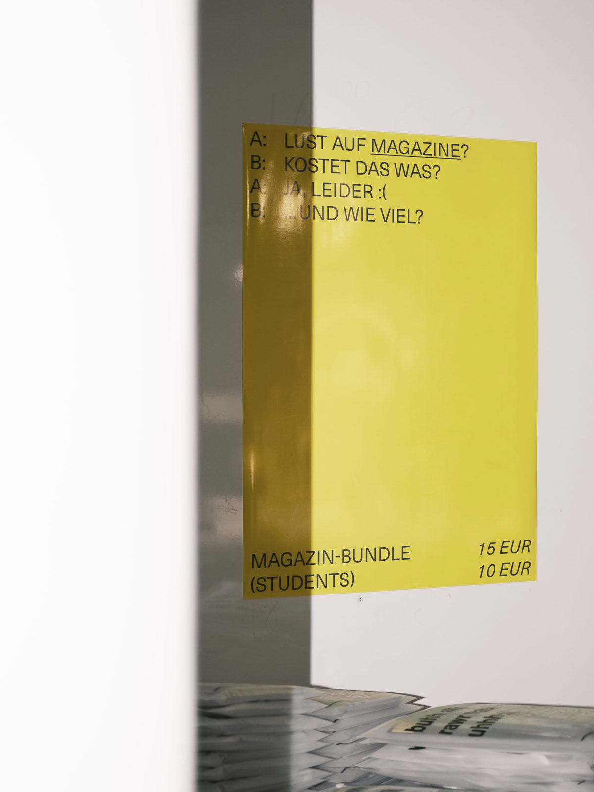
“Grau – Grün Kontrast” pays homage to the bright green and gray tones of spring. The tension between the leaves washed clean by the rain and the intense gray of a cloudy Sunday are the signs for the beginning of something new.


“Grau – Grün Kontrast” pays homage to the bright green and gray tones of spring. The tension between the leaves washed clean by the rain and the intense gray of a cloudy Sunday are the signs for the beginning of something new.


